Contact Us Email Call Now Whatsapp

Responsive Website Designer

Transform your online presence with expert responsive website design. Our mobile-first approach ensures your website looks perfect and functions flawlessly on every device.

Expert Responsive Website Designer

With 10+ years of experience as a responsive website designer, we've created 300+ mobile-optimized websites that deliver exceptional user experiences across all devices

In today's mobile-first world, responsive website design isn't just an option—it's essential. As a specialized responsive website designer, we understand that:

  • 70% of web traffic comes from mobile devices
  • Google prioritizes mobile-friendly websites in search results
  • Poor mobile experience leads to 67% higher bounce rates
  • Responsive design improves conversion rates by 40%

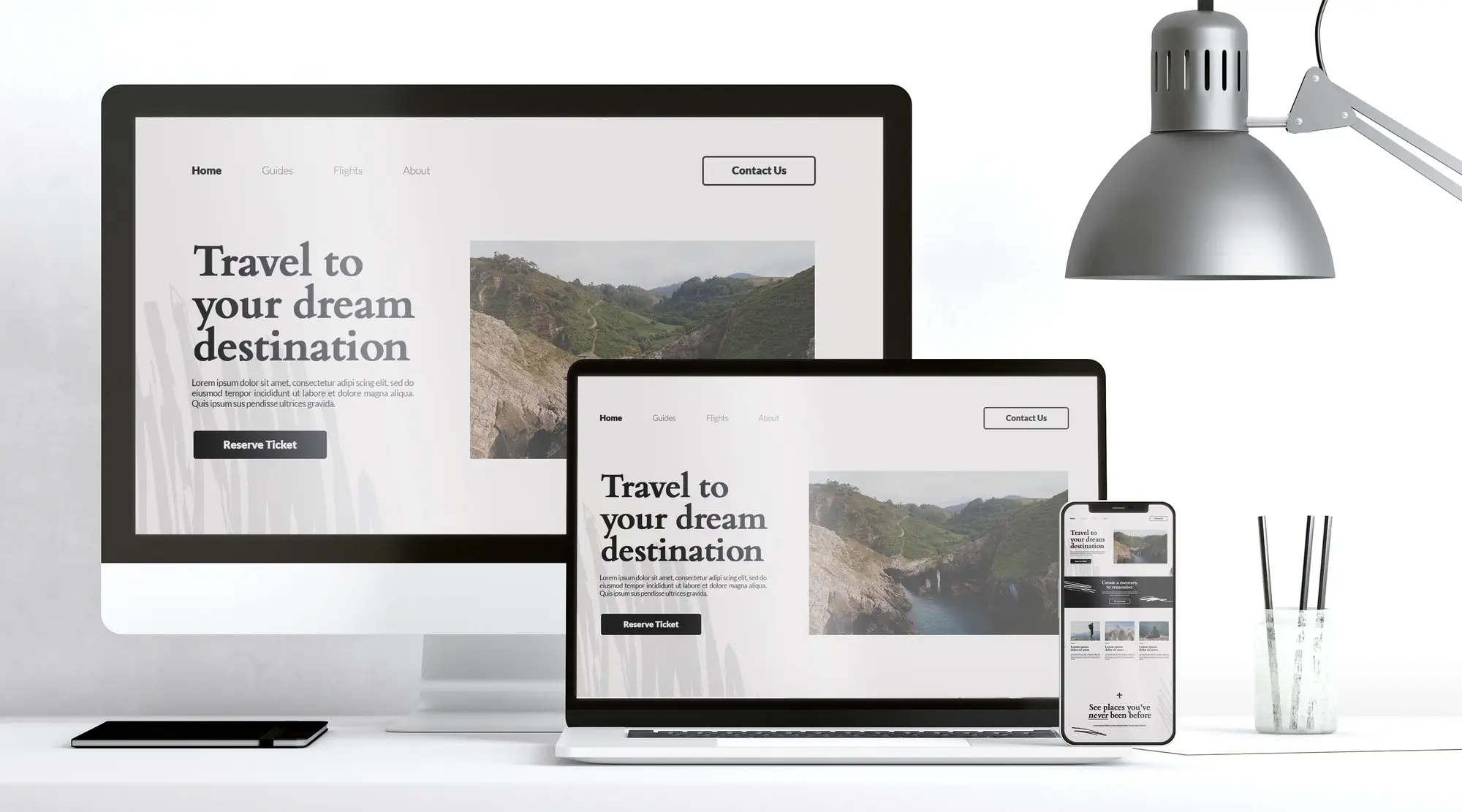
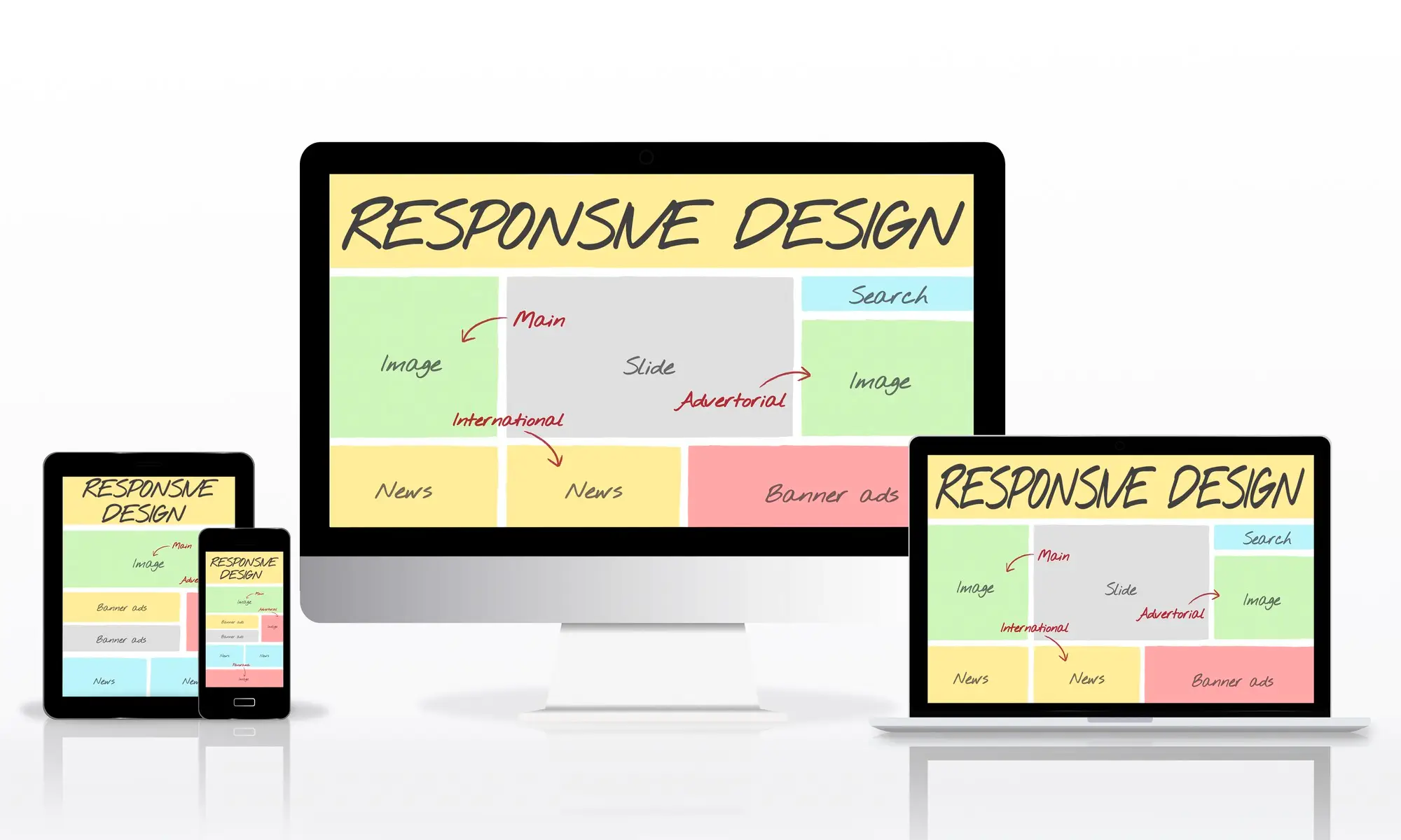
Our responsive designs adapt seamlessly to any screen size, ensuring your visitors enjoy a perfect experience whether they're on a smartphone, tablet, or desktop. This leads to better user engagement and higher conversion rates.

300+

Responsive Sites

98%

Mobile Score

40%

Better Conversions

Responsive Website Designer - Neu Website Designers
Mobile First
Tablet Ready
Desktop Perfect
Fast Loading
Expert Responsive Website Designer • Free Mobile Optimization Audit • 300+ Mobile-Optimized Websites • Mobile-First Design Approach • 40% Better Conversion Rates • 98% Mobile Performance Score •

How Responsive Design Works

One design that adapts beautifully to every screen size and device

Benefits of Responsive Website Design

Why every modern website needs responsive design for success

Mobile-First Experience

Designed specifically for mobile users first, then scaled up for larger screens, ensuring optimal performance where it matters most.

Better SEO Rankings

Google's mobile-first indexing prioritizes responsive websites, helping you rank higher in search results and attract more organic traffic.

Improved User Experience

Seamless navigation and readability across all devices reduce bounce rates and increase time spent on your website.

Higher Conversion Rates

Optimized user experience leads to more inquiries, sales, and goal completions across all devices and screen sizes.

Cost-Effective Solution

One responsive website serves all devices, eliminating the need for separate mobile apps or multiple website versions.

Easy Maintenance

Single website to update and maintain, reducing ongoing costs and simplifying content management across all platforms.

Cross-Device Compatibility

Perfect performance across all devices and screen resolutions

Mobile Phones

320px - 768px

  • • Touch-optimized navigation
  • • Readable text without zooming
  • • Fast loading on mobile networks
  • • Thumb-friendly button sizes

Tablets

768px - 1024px

  • • Optimized for both orientations
  • • Enhanced content layout
  • • Touch and mouse compatibility
  • • Perfect content hierarchy

Desktop & Laptop

1024px+

  • • Full-featured experience
  • • Multi-column layouts
  • • Advanced interactions
  • • Maximum content visibility

Why Choose Our Responsive Website Design Services?

We deliver exceptional responsive designs that work perfectly on every device

Mobile-First Approach

We design for mobile devices first, then enhance for larger screens, ensuring optimal performance where most users browse

Clean, Optimized Code

Hand-coded responsive websites using modern CSS frameworks and best practices for fast loading and excellent performance

Visual Consistency

Your brand looks perfect across all devices with consistent typography, colors, and layout that maintains brand integrity

Fast Loading Speed

Optimized images, efficient code, and performance-focused development ensure fast loading times on all devices

SEO Optimized

Responsive design with SEO best practices built-in to help your website rank higher in search engine results

Future-Proof Design

Built to adapt to new devices and screen sizes, ensuring your website remains effective as technology evolves

Mobile Web Usage Statistics

Why responsive design is crucial for your business success

70%

Mobile Web Traffic

67%

Higher Bounce Rate on Non-Responsive Sites

40%

Conversion Rate Improvement

3 sec

Mobile User Patience Limit

85%

Adults Use Mobile Daily

1st

Google's Mobile-First Priority

Our Responsive Design Process

A systematic approach ensuring perfect functionality across all devices

1

Device Research

We analyze your target audience's device usage patterns and screen preferences to inform our responsive design strategy and ensure optimal coverage.

2

Mobile-First Design

Starting with the smallest screen, we create the core experience and progressively enhance it for larger devices, ensuring nothing is lost in translation.

3

Flexible Development

Using modern CSS techniques, flexible grids, and adaptive images, we build websites that smoothly adapt to any screen size or orientation.

4

Cross-Device Testing

Rigorous testing across multiple devices, browsers, and screen sizes ensures your website performs flawlessly for every visitor.

Responsive Design for Every Industry

Mobile-optimized solutions tailored to specific industry needs

E-commerce & Retail

Mobile shopping optimization

  • Touch-optimized product browsing
  • Mobile-friendly checkout process
  • Swipe-enabled product galleries
  • One-touch payment options
  • Quick product search and filters
  • Mobile cart optimization

Healthcare & Medical

Patient-friendly mobile access

  • Mobile appointment booking
  • Easy-to-read medical information
  • Quick contact and emergency info
  • Patient portal mobile access
  • Location and directions
  • Mobile-friendly forms

Real Estate

Property browsing on-the-go

  • Mobile property search
  • Touch-friendly photo galleries
  • Map integration and directions
  • Quick inquiry forms
  • Agent contact optimization
  • Virtual tour compatibility

Restaurants & Food

Mobile dining experiences

  • Mobile-optimized menus
  • Easy online ordering
  • Table reservation system
  • Location and hours display
  • Food delivery integration
  • Social media connectivity

Professional Services

Business-focused mobile design

  • Mobile-friendly contact forms
  • Service information clarity
  • Professional portfolio display
  • Easy consultation booking
  • Testimonial presentation
  • Quick quote requests

Education & Training

Learning-optimized mobile design

  • Mobile-friendly course browsing
  • Easy enrollment process
  • Student portal access
  • Event and news updates
  • Campus information display
  • Contact and inquiry forms

Ready to Make Your Website Mobile-Perfect?

Don't lose customers to poor mobile experience. Get professional responsive website design that works flawlessly on every device and boosts your conversions!

Our Responsive Design Portfolio

Mobile-optimized websites that deliver exceptional user experiences

IGI Coating

Gachibowli
Redesign increased leads by 120% within 45 days

Priyanka Group

Secandrabad
New Company Website boosted enquiries by 200% in 3 months

Salohi Technologies

HITECH City
New UI/UX and SEO boosted organic traffic by 3x

What Our Clients Say

Real experiences from businesses who improved their mobile presence

"The responsive design transformed our website completely! Mobile traffic increased by 85% and our mobile conversion rate doubled. The design looks perfect on every device."

Rajesh Kumar
CEO, TechSolutions

"Our mobile bounce rate dropped from 70% to 25% after the responsive redesign. The user experience is seamless across all devices. Excellent work!"

Priya Sharma
Owner, Fashion Boutique

"The mobile-first approach was exactly what we needed. Our restaurant's online orders increased by 150% with the new responsive design. Customers love the easy mobile ordering!"

Vikram Reddy
Restaurant Owner

"Professional responsive design that exceeded our expectations. The website loads fast on mobile and tablet, and our Google ranking improved significantly since launch."

Kavitha Gupta
Healthcare Practice

Get In Touch

Ready to begin your journey? Contact us today for free counseling

Location

Madhapur, Hyderabad
Telangana, India

Email

info@neuwebsitedesigners.com

Frequently Asked Questions

Common questions about responsive website design services

Responsive website design is an approach that makes web pages render well on all devices and screen sizes. The layout automatically adjusts and adapts to provide optimal viewing experience across desktop, tablet, and mobile devices.

Mobile-first design is crucial because 70% of web traffic comes from mobile devices. Google also uses mobile-first indexing, meaning it primarily uses the mobile version of your site for ranking and understanding your content.

Responsive design significantly improves SEO by providing better user experience, faster loading times, and mobile compatibility. Google rewards mobile-friendly websites with higher search rankings and better visibility.

Yes, we can convert existing websites to responsive design. Depending on the current structure, we may recommend a complete redesign or modify the existing layout to ensure optimal mobile compatibility and performance.

We use a combination of real device testing, browser developer tools, and professional testing tools to ensure your website works perfectly across all screen sizes, browsers, and operating systems before launch.